


an international project
#36DaysOfType is an international project that challenges artists, designers, and illustrators to create their own interpretation of the letters and numbers of the Latin alphabet. Every single day for 36 days. As an admirer of the project for the past few years, I decided to finally participate in the 7th series that started on March 1, 2020. Nina Sans and Rafa Goicoechea, two graphic designers from Barcelona, originally started this initiative in 2014 as a personal project. “They decided to challenge themselves to create something new everyday, as a way to experiment with new things, creating personal daily design challenges around typography and graphic design.”


alliterations, a colour palette and a grid plan
When I commit to a project I am passionate about, it’s usually with a lot of heart, a lot of ideas, and a lot of work. I decided that I wanted my unique lettering series to be inspired by alliterations, this made it easier in order to determine what style the letters would take. For example: Big, Bold & Bohemian B, Dazzling Art Deco D In Digital, Gothic G on Glass, Opulent Ornate O; you can only imagine what comes to mind with these words. I really had fun with this challenge and wanted to try a variety of styles to mix it up and get out of my comfort zone; it worked.

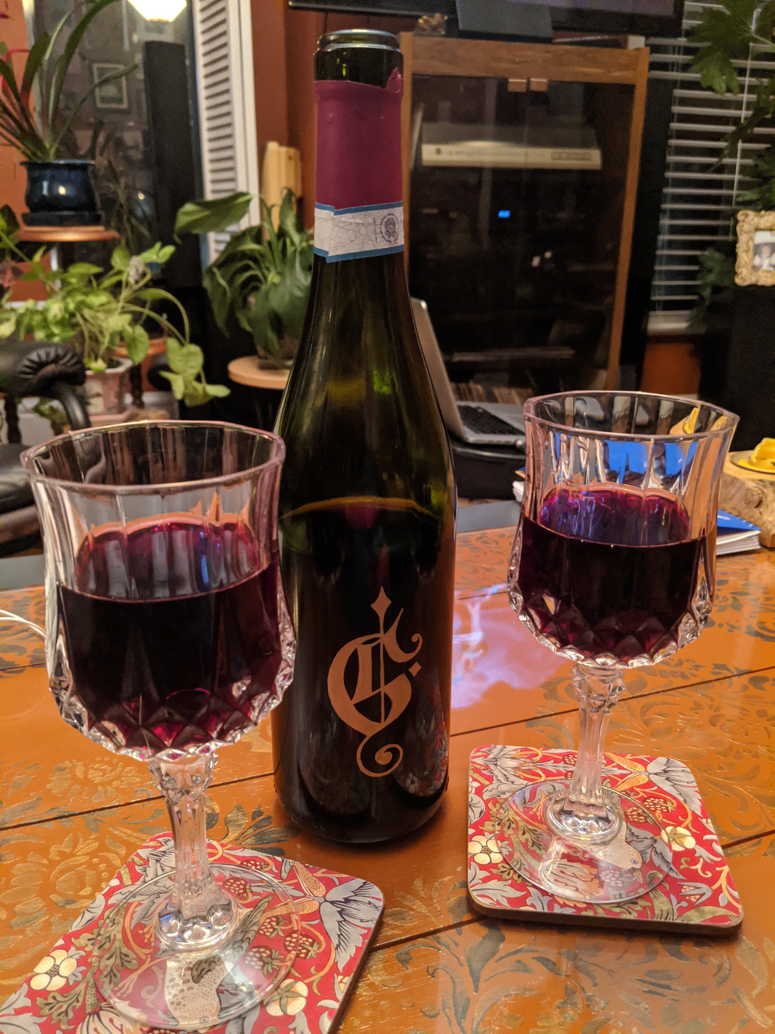
I used a few different mediums, taking advantage of my painted chalkboard at home and some gold paint markers. Because the challenge was based on Instagram, grid planning was also important in order for the letters to be visually cohesive, and so I planned out the tiling and coloured backgrounds. Choosing my favourite colour combination at the time: burnt orange, turquoise, mint, teal, white, black, and gold (not enough gold in my opinion), everything came together nicely. Feel feel to take another look at my ornate letters all together and you might appreciate a few more details now.


digital lettering with the ipad pro
I thought I would be playing with a lot more mediums like I started out with but ended up creating the majority of designs on my iPad Pro. This was a good and a bad thing because I have been wanting to explore more on a program called Procreate, but this also meant the possibilities were endless and I spent a lot of time staring at a screen all day and night. It can be exhausting, but definitely a learning experience and having this community of artists helped me to push my limits and see what I was capable of. Scary, but rewarding.


staying creative during quarantine
This project started and continued throughout a strange time in history: March 2020. I will never forget the time I drew these letters because of Covid-19 and the isolation period during this challenge that continues as I am writing this almost two months later. It was definitely an interesting journey during this bizarre time in the world. At first, I felt a bit uncomfortable drawing a letter almost every day when it didn't seem important; I contemplated stopping for personal reasons, but eventually persevered to complete the challenge even though I was way behind. Oh well, better late than never is one of my key mantras. I am super grateful for being part of an international lettering community that inspired me to create and added some normalcy into my life that was helpful and necessary at the time. And because of this challenge I had some meditative moments and peace of mind as an artist and human.
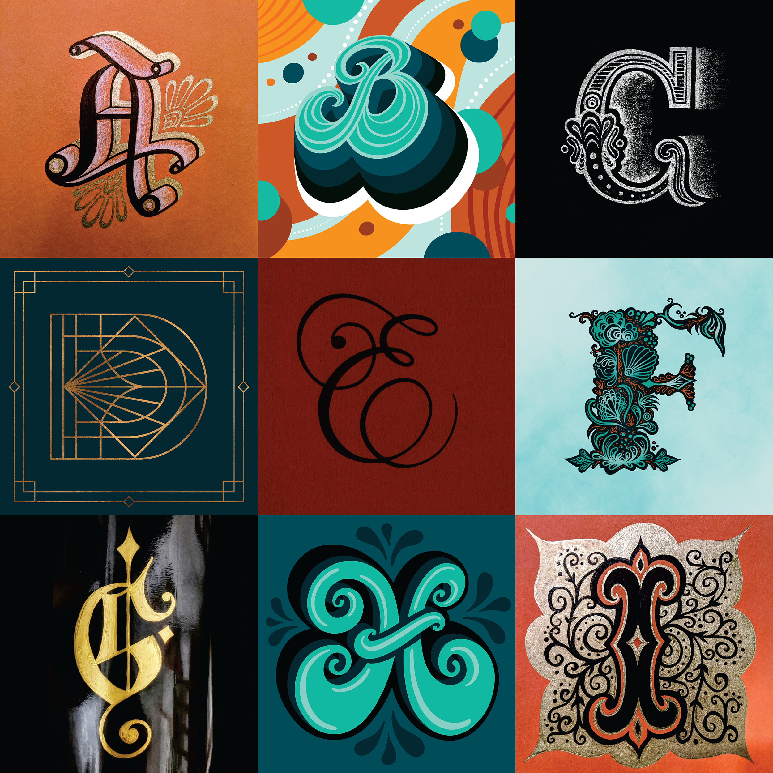
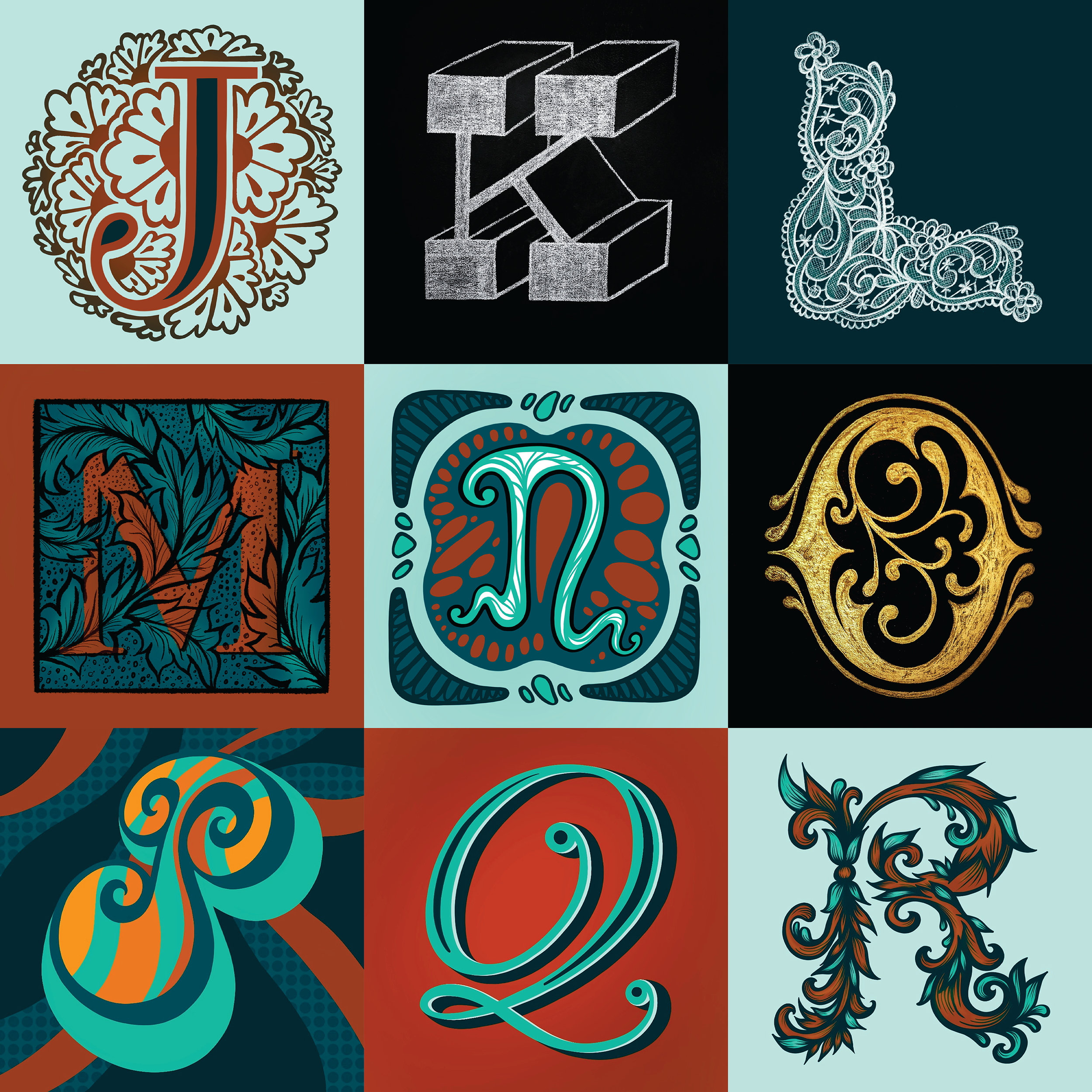
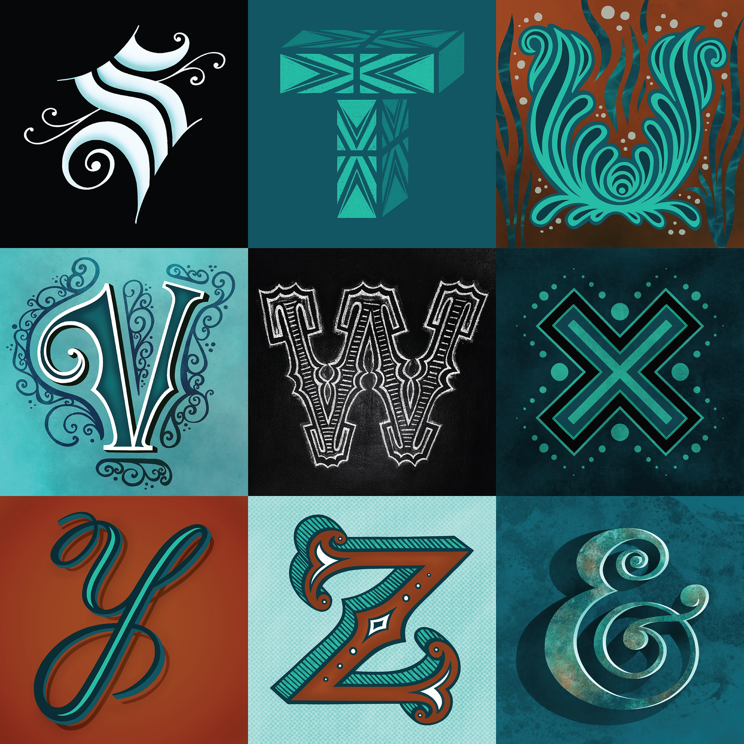
the final letters and bonus ampersand
I would love to know if you have a favourite letter and/or number or if you really like the ampersand the best? Let me know.
P.S. In case you are curious, some of my favourite letters I drew are D, F, L, M, R.
Stay tuned till 36 Days of Type 2021!
